We started Dan with a mission to empower entrepreneurs and make the domain world a better, more transparent place. We are pioneering as the partner of entrepreneurs, stakeholders, and the rest of the industry to name, build and grow their business.
Today we are announcing the evolution of our brand, a major step towards empowering everyone to build towards their goals. Our brand is growing to incorporate an inspiring visual identity that strengthens our mission and complements the simplicity of our tools.
We’re still the same Dan, just with more space to grow.
A voice speaks volumes
How we communicate speaks volumes about who we are. It’s what sets us apart, enhances the functionality of our touchpoints and makes you feel good when you use our product. Or when you come in contact with us.
In short: our brand voice is the way we communicate with you.
It’s built on 3 principles that guide our communications and give our messaging consistency.
png
A refined Dot
A great logo is like a magic satchel: a small, simple thing that can be endlessly filled with value, without ever losing its form.
To start we did some exploration with the dot in Dan.com. The challenging part about the dot is taking ownership of the shape since a circle (dot) is one of the most common shapes around.
png
Graphik Dan, our pleasurable and readable font
Fonts play a big role when it comes to the online tools you are using daily. We chose a new font that has the perfect balance of practicality and creative expression which is at the core of our distinct style.
But we didn’t stop there by just choosing some font. We know being able to read the domain name properly is mandatory. Therefore we’ve customized specific letters in our font to make a clear distinction between letters. For example, the uppercase i and lowercase L look very similar, which we took care of so no one has to guess what the domain name might be.
png
Color with a lot of depth
Colour speaks volumes. It attracts and moves people. Our new primary colors are an energetic brand expression building recognition in moments when our voice must be clear and memorable. Aside from being distinct, our new primary color is sophisticated and empowering.
Our secondary palette allows us to be more flexible and dynamic. We use this palette in both functional and surprising ways, mostly when we stretch our legs and show up in the world on things like t-shirts or that sticker on your laptop.
png
Simple illustrations for complex things
We imagined a world where everyone can build their future using various elements in a way that works for their unique goals. Whether it’s about starting a new business or extending it. We know buying and selling domain names can be complicated. Our new illustration style allows us to communicate about complex tools and practices in a simpler and more human way.
png
What’s changed and what hasn’t
We’ve updated our logo, wordmark, typeface, colours, and imagery like illustrations. We’ve also evolved from “DAN.COM” to “Dan.com” with just a capital D. Our name began as a metaphor: Domain Automation Network. These days we do focus more on becoming the partner of entrepreneurs, stakeholders, and the rest of the industry, and our name stands for more than just automation.
Aside from new colours and looking more fresh, we want to make sure the transition towards your new workflow at Dan will go gradually instead of a massive change once. A couple of highlights for this update:
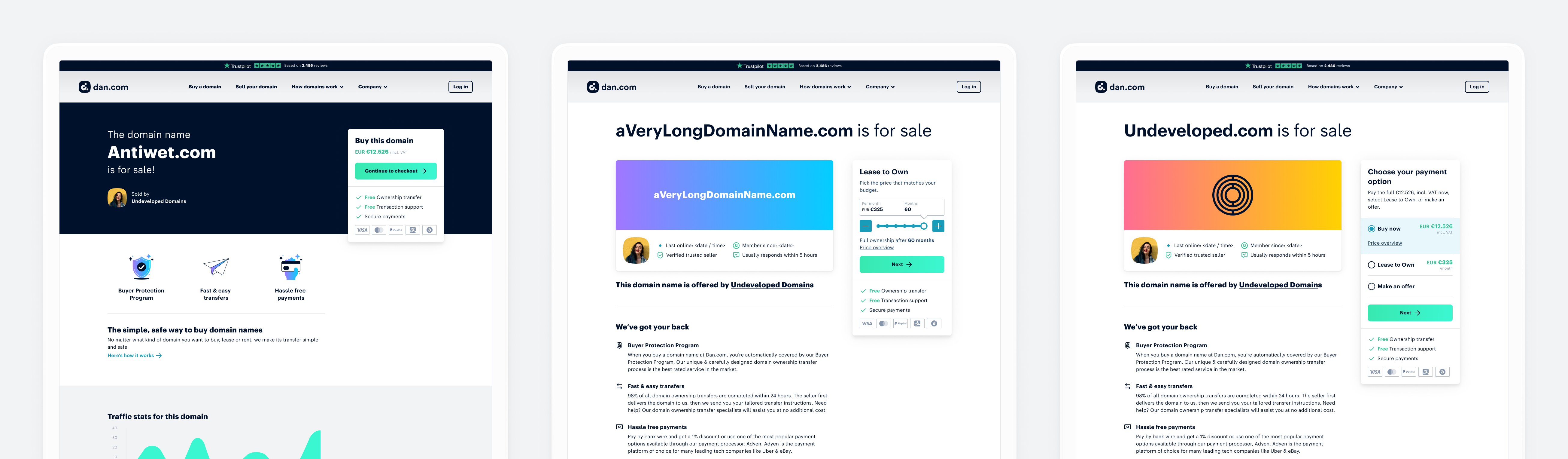
For Sale pages
We have streamlined the buying options for the For Sale Pages;
All For Sale Pages have been optimized for mobile purchases;
We’ve given our ‘Standard For Sale Page’ more options. From now on you can choose any colour for your header background. And you’re also able to have a predefined colour overlay for your (animated) images;
We’ve designed a new For Sale Page template. This version is a more brand-able and informative option for portfolio holders. You can even create your own brand card!;
png
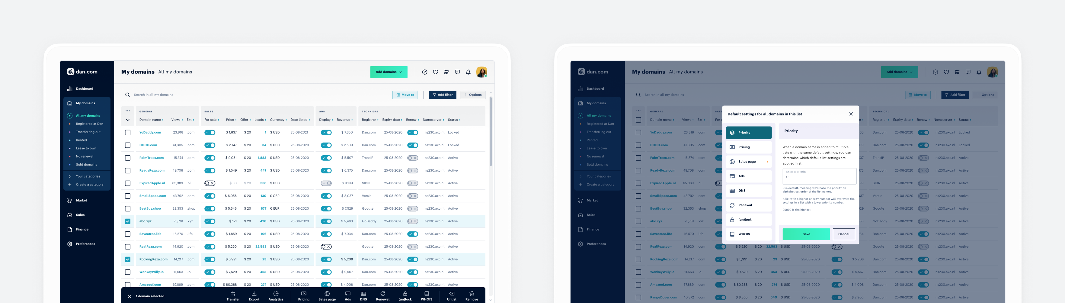
Customer Area update
Our Customer Area has a more clear way of navigating;
Our Transaction window has been updated to make it better readable;
Our settings are updated to clarify your selection.
png
Other updates
We’ve put extra emphasis on our processes to become a more transparent and trustworthy marketplace. To achieve this we’ve completely redesigned our public pages from scratch;
We have improved our checkout process;
png
There's more to come
From early on, we were determined to comprehensively roll out this new brand. It’s not the Dan way to just slap a new logo on the website and tweak the colours; if a rebrand is to be successful, it needs full commitment.
So, the past few months we’ve been working hard to apply the brand system to every facet of our company and products. And after a lot of research and listening to your needs, we have some massive product updates in the pipeline, which we’ll add continuously within the next months.
Add categories & categories settings to keep easily track of your domain names;
Offering fully integrated registrar services;
Easily bulk edit your domain names settings;
Payoneer integration for payouts;Account balances;
Increase prices in percentages or by a certain amount;
Advanced filters for your domain overview;
And more to come.
png
We'd love to know what you think
We want to empower you and make the domain world a better, more transparent place — and we’d love to know what you think.
But we can’t do it without you. Do you want to help us build some new Dan features?
Sign up to be part of our first Beta research and testing group. This will allow you to be a part of the continuous improvement and growth of Dan.
Or if you’re interested in joining our Dan team, please check out our current openings.
Author’s Note: This rebrand wouldn’t have been possible without the hard work and contributions of dozens of people. Major props go to the entire Dan team. And of course the good folks at Make it Max and Mr. Koreander for their steadfast dedication to helping us create and execute this new brand identity and design system.
What’s new at Dan? In our product updates, we share some of our recent product features and improvements. While we have new updates to share, our mission to make domain trading available to everyon...


